How to turn a sketch into an AI illustration
Develop your own sketch into an illustration using controlled edits, visual references and palette choices, with a checklist for preserving the idea.

In this article
To turn a sketch into an AI illustration, begin with the drawing's essential decisions: its composition, gesture and recognizable shapes. Use the sketch as an image reference, describe a specific finish, then compare the result with the drawing. Refine the illustration through focused changes instead of replacing the idea with a new image at every step.
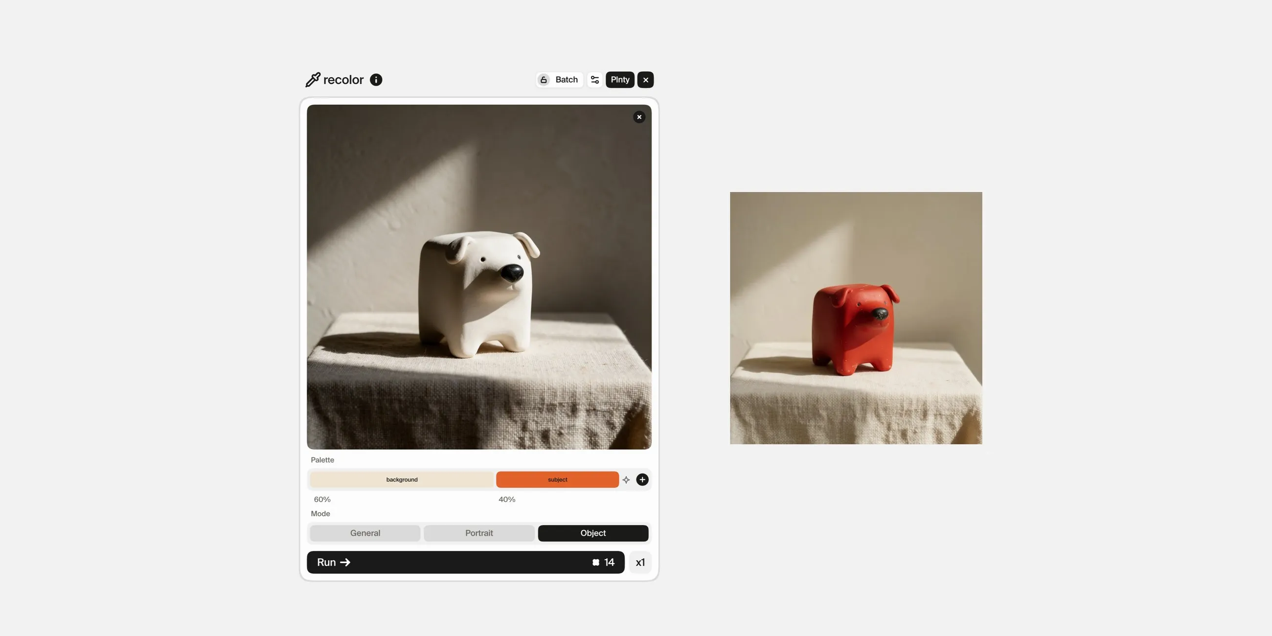
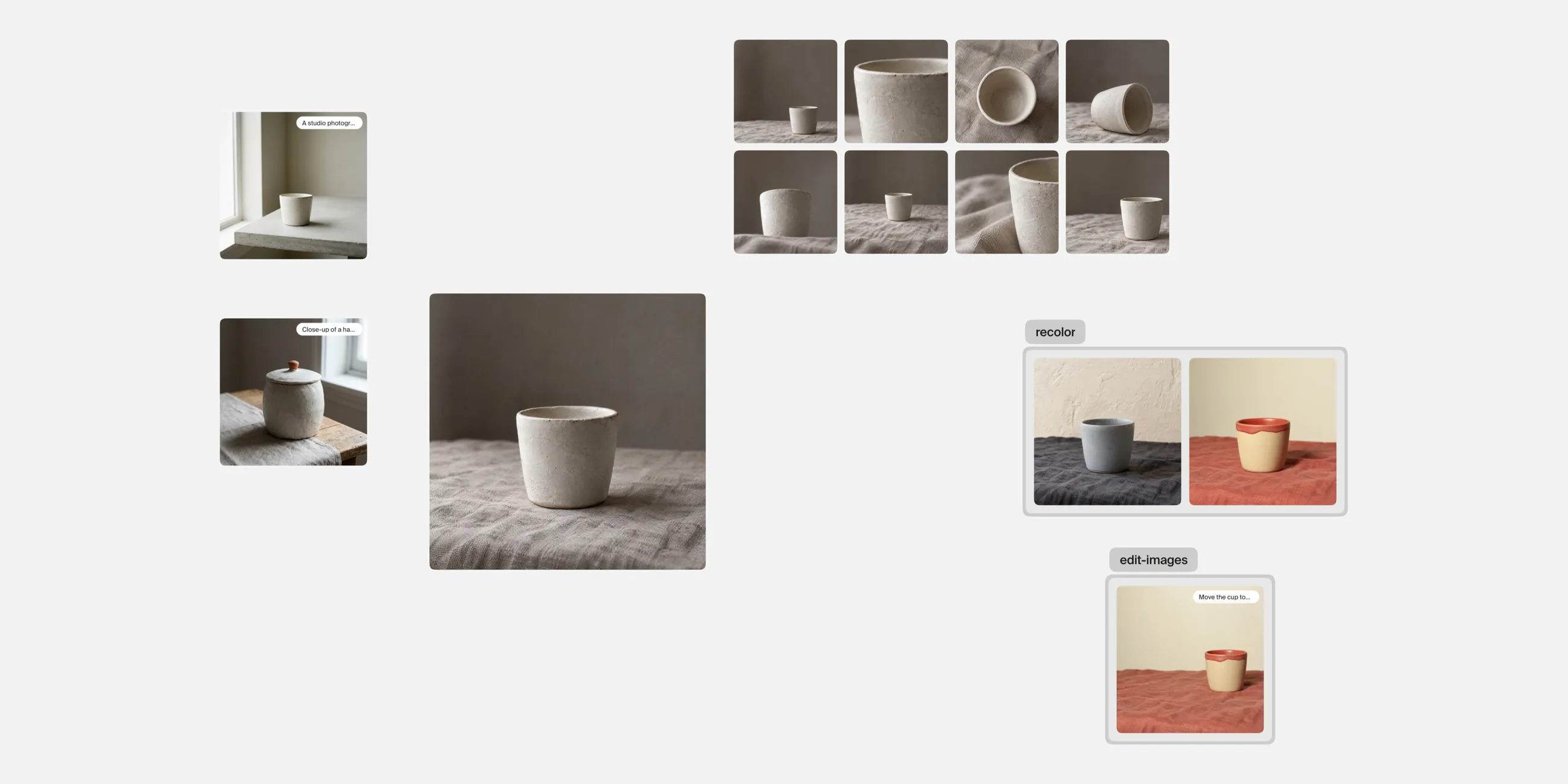
The sketch can be rough. What matters is whether it communicates the structure you want to develop. In Plnty, you can use image-gen in edit-image mode to work from the sketch, Style transfer mode to explore a visual treatment, and recolor to refine a selected image's palette.
On this page
Prepare a sketch with a readable intention
Photograph or export the drawing so that the important lines are visible. Remove avoidable distractions from the image, such as a dark camera shadow across the paper.
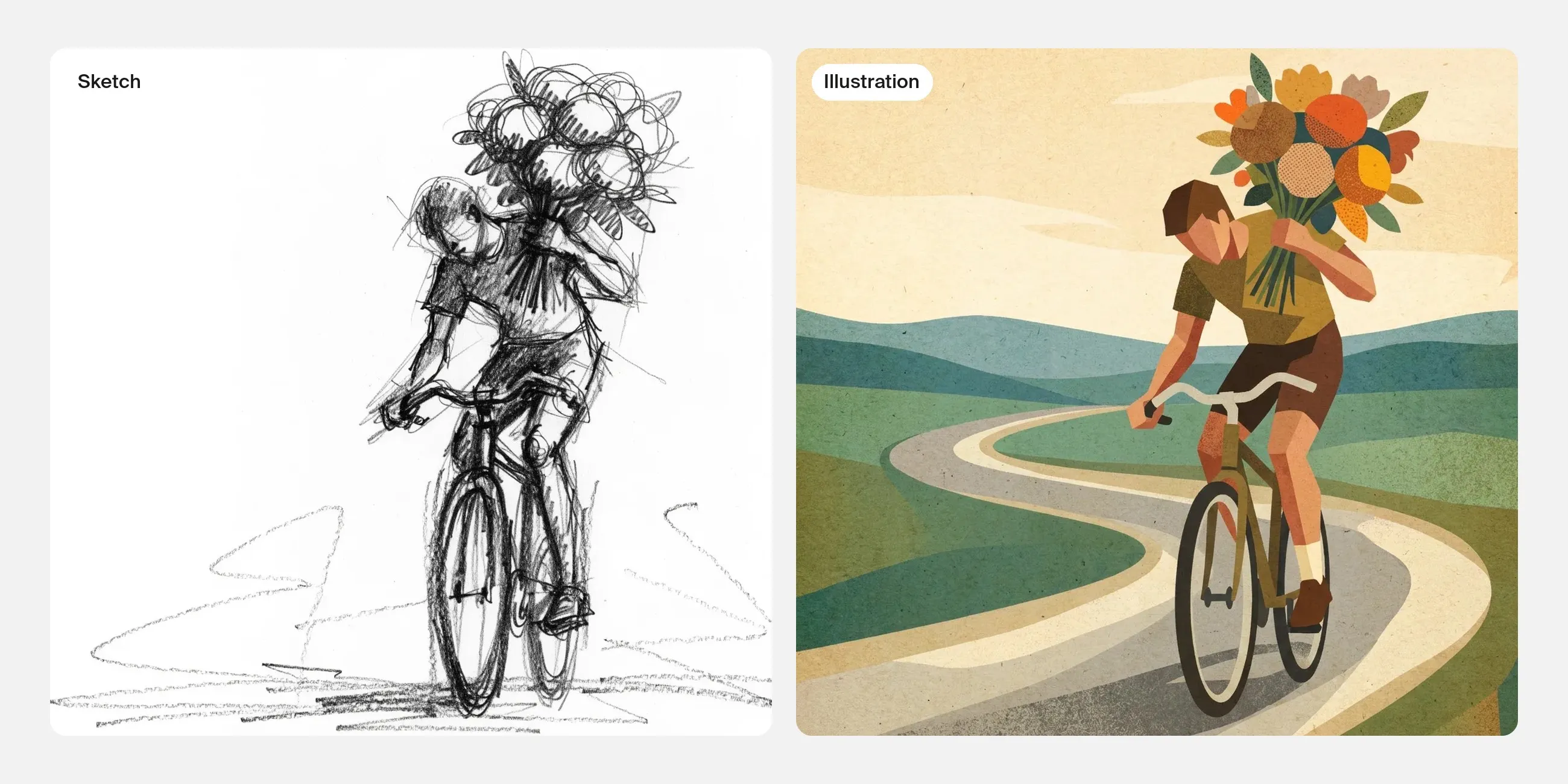
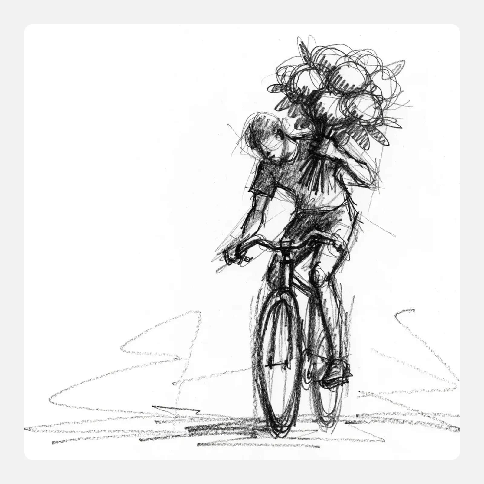
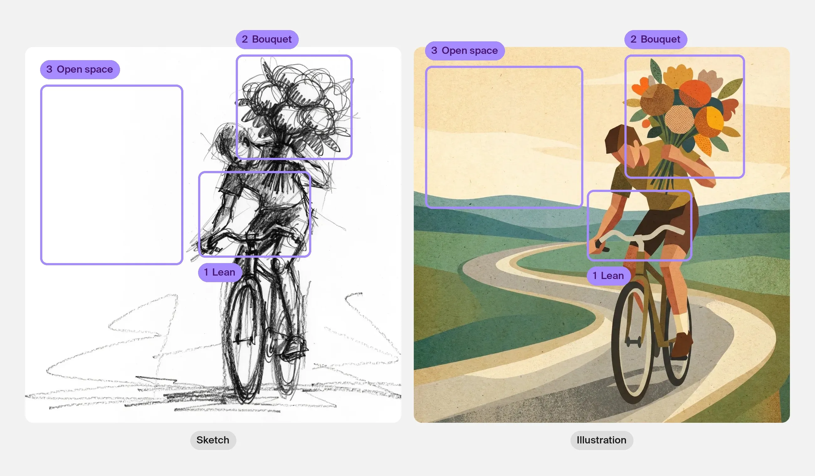
You do not need to resolve every detail. You do need to know which decisions matter. For a drawing of a cyclist carrying an oversized bouquet, these might be the forward movement, the large flower shape and the empty space ahead of the bicycle.
Write down the features you want to keep. This gives you a better review standard than whether the output looks polished.
Choose one finishing direction
Describe the medium and level of finish you want to explore. For example:
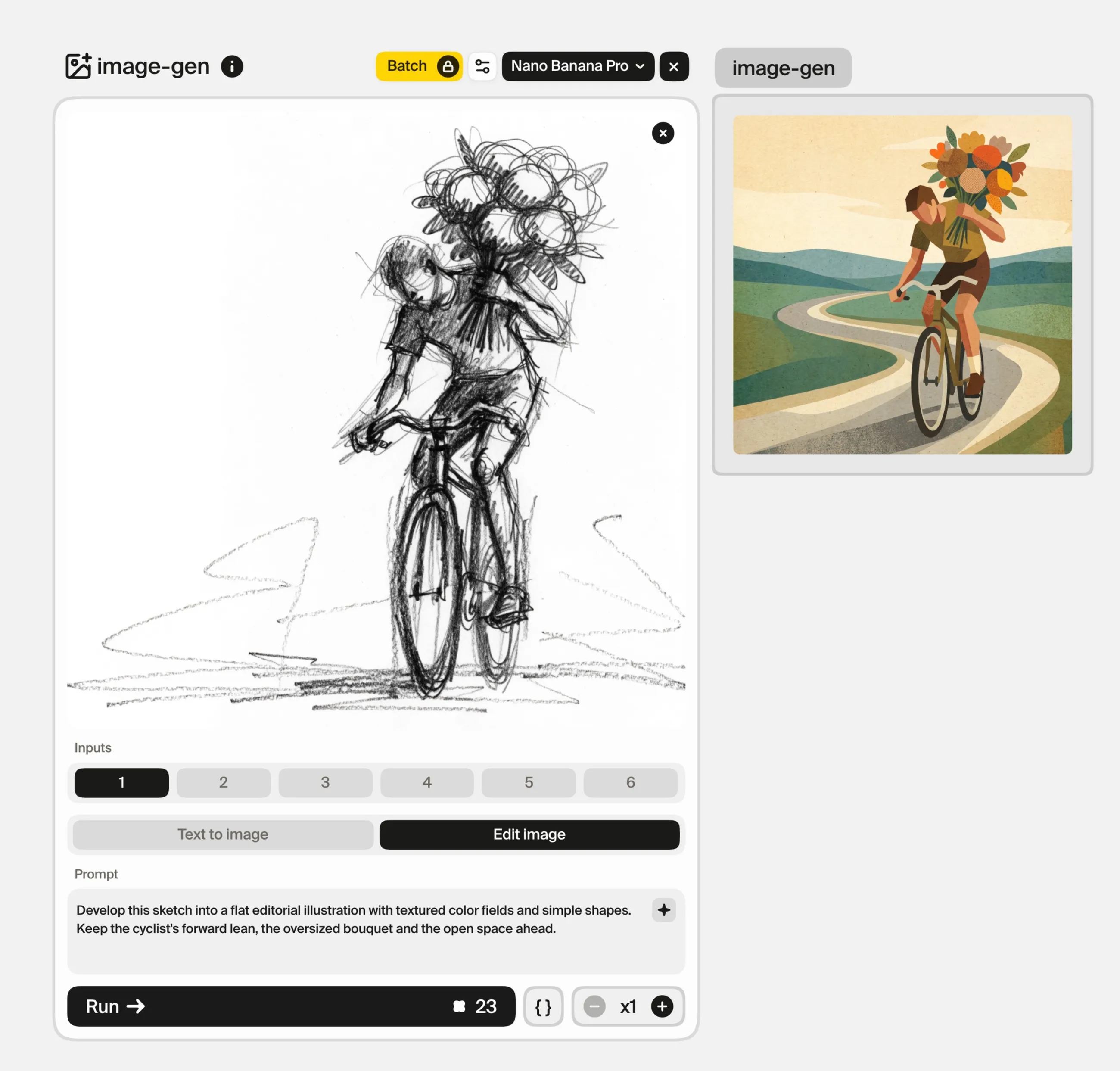
Develop this sketch into a flat editorial illustration with textured color fields and simple shapes. Keep the cyclist's forward lean, the oversized bouquet and the open space ahead.
This is a starting instruction, not a guarantee that the geometry will remain unchanged.
Avoid requesting several conflicting finishes in the same pass. A tightly rendered photographic treatment and a sparse graphic drawing solve different visual problems. Explore them separately if you genuinely need to compare them.
Develop the drawing with an image edit
Bring the sketch into Plnty and use image-gen to describe the intended development. Compare the first output against the original before adding more detail.
Look for the drawing's structure:
- Is the main gesture still clear?
- Does the composition guide attention in the same way?
- Are the objects connected sensibly?
- Has a deliberately exaggerated shape become ordinary?
- Has the tool invented detail that distracts from the idea?
A polished result that loses the composition may be less useful than a rougher result that retains it. Select the version that gives you the strongest base for refinement.
Use a reference when words leave too much open
If you want a particular texture or visual treatment, try Style transfer mode with the sketch or selected illustration as Subject and a suitable reference as Style.
Start with two images so that the relationship is easy to evaluate. A paper-texture reference might guide the surface quality; a finished illustration might also influence shading, forms and color. Inspect how much of each influence entered the result.
Keep the original sketch visible. It remains the source of the visual idea, even when the reference contributes the finish.
Refine color and details separately
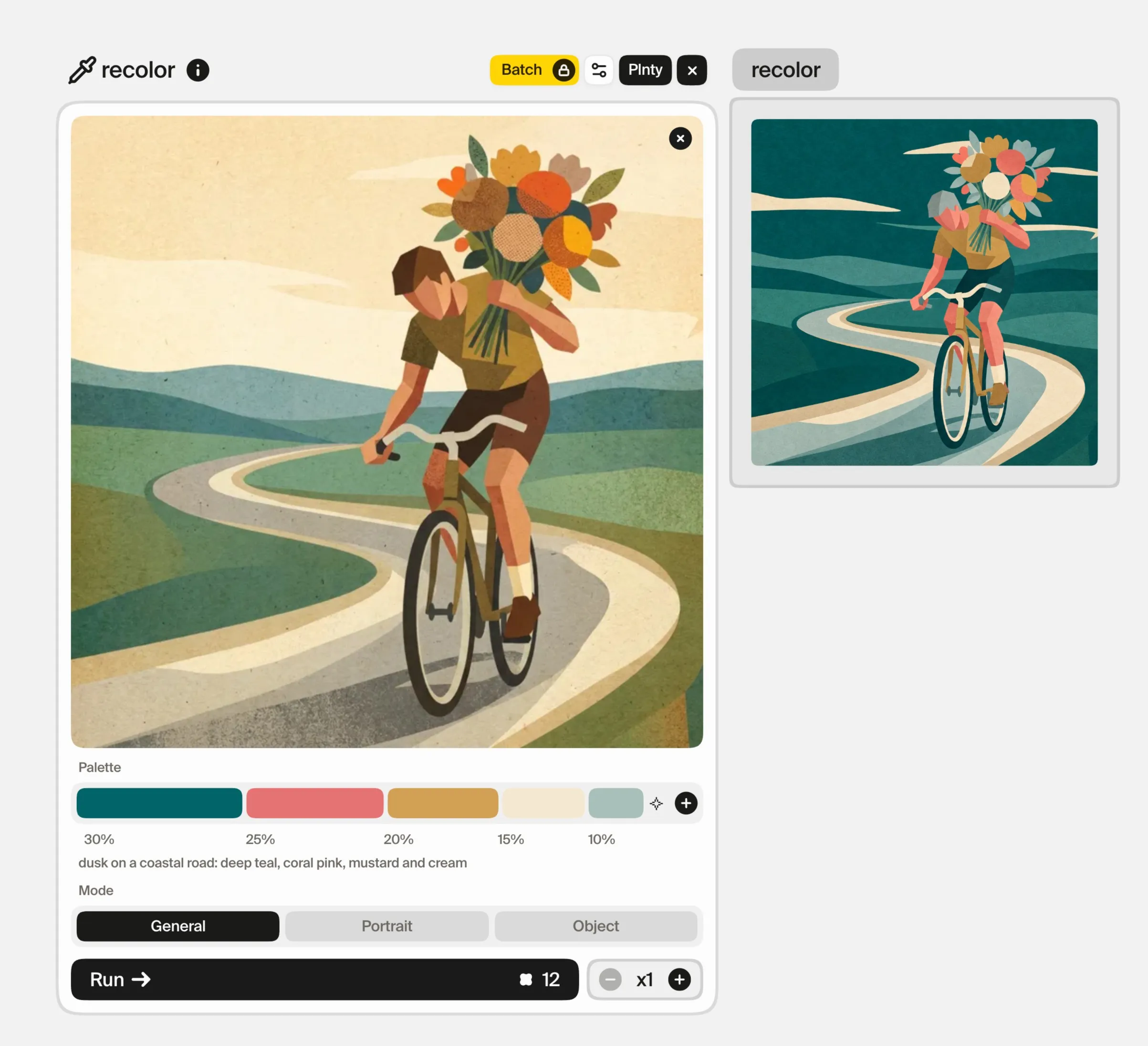
Use recolor when you like the structure but want to explore a specific palette. Choose the colors and their relative weights, then inspect whether the hierarchy still works.
For a structural correction, return to image-gen with a narrow request. If the correction needs a defined region, use inpaint to mark the area. For example, you may want to repair a handlebar without inviting a redesign of the whole composition.
Review each accepted change at both full size and thumbnail size. Detail can improve the finish while making the central idea harder to read.
Know when the illustration is ready for its layout
Before placing the image in an article, poster or campaign, compare it with the original intention and the output requirements.
Check edges, anatomy, object connections and any printed text. Inspect the image at the actual size where it will appear. If it needs a background extension or a different crop, review that as another design decision.
Add final typography and production details in your layout workflow. A finished-looking raster image is not automatically an editable illustration file with the layers or vectors a project may require.
Common questions
Does the sketch need to be detailed?
It needs to communicate the choices that matter. Clear composition and readable shapes can be more useful than decorative detail that does not affect the final idea.
Can I keep the exact original linework?
Do not assume a generative edit will preserve every stroke. If exact lines are essential, retain the original drawing as a separate layer in an appropriate editing workflow and develop supporting elements around it.
What if the result looks good but no longer feels like my sketch?
Return to the source, identify the lost decision, and make a narrower request. Avoid accepting polish as a substitute for the idea you wanted to develop.
Sources and methodology
The pictures in this guide were made in Plnty on 1 October 2026 with the tools and settings each card shows. The sketch is an illustrative example.
About the author

Try it in Plnty
Start with a sketch you care about in Plnty, choose the decisions you want to preserve, and develop the finish around them.