How to art-direct AI images with references, composition and color
A generated image can look impressive and still miss the idea. The subject is right, but the material feels wrong. The colors work, but the composition leaves nowhere for the headline. Another generation might fix one problem and introduce three more.

In this article
Art-directing AI images means deciding what should change, choosing the appropriate control, and judging the result against a visual intention. In Plnty, you can use style-transfer to work with subject and style references, variations to explore composition, recolor to guide the palette, and edit-images for a specific written revision.
The process starts with a decision about the image you want to make.
On this page
Start by separating what stays from what changes
Before opening a tool, write down two things: what makes the image worth keeping, and what prevents it from working.
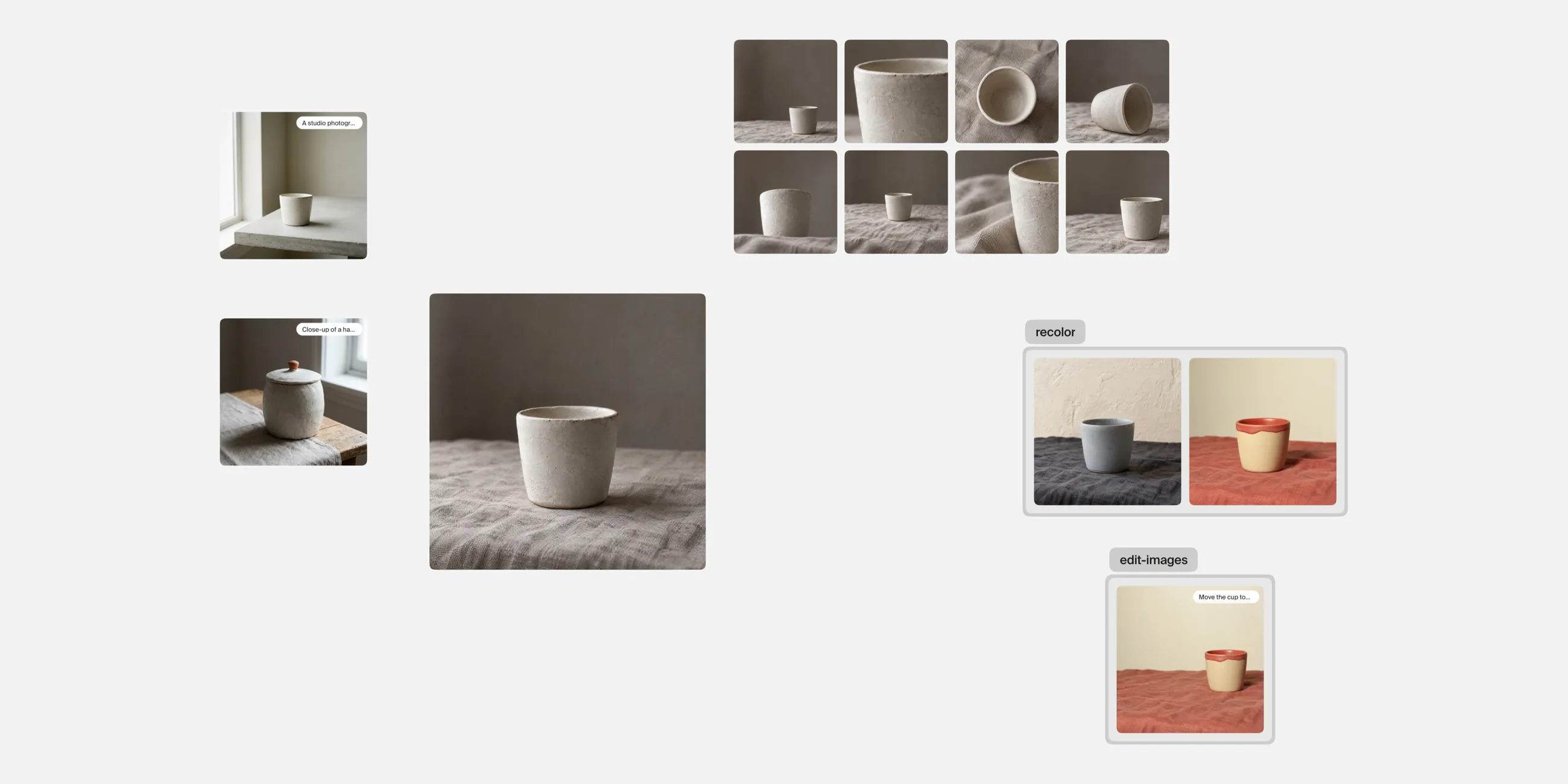
Imagine you have a photograph of a ceramic cup and want to develop an editorial campaign image. Your direction might be:
Keep the cup recognizable. Explore a softer, handmade visual treatment. Leave space on the left for a headline. Use a warm palette with one contrasting accent.
That gives you separate decisions about subject, style, composition and color. You can explore each one and see whether it helps.
Keep the original image beside your experiments on the Plnty canvas. It gives you a consistent reference when the results start moving away from where you began.
1. Give your references different jobs
A subject reference answers “What is this image about?” A style reference answers “What should it look and feel like?”
Those roles matter. Without them, a reference image can introduce unwanted objects or a different composition when you only wanted its texture.
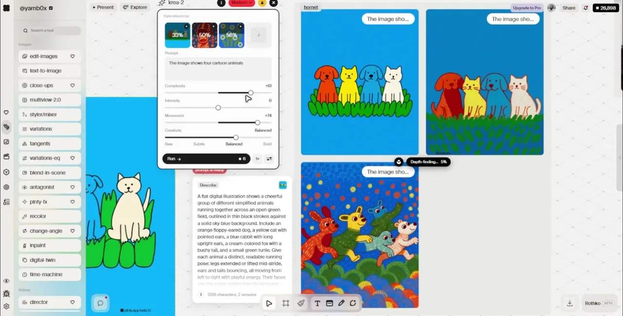
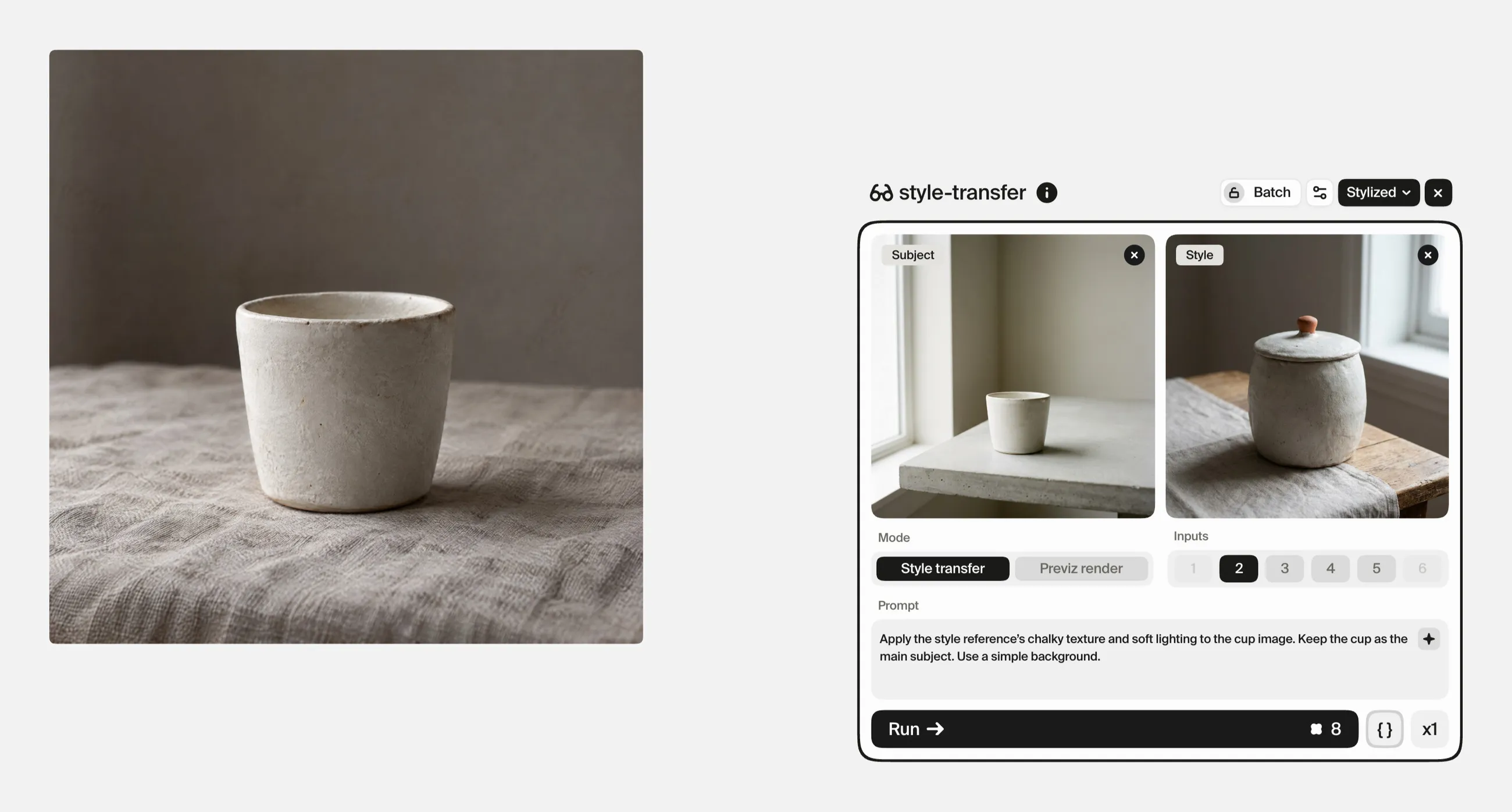
In style-transfer, add your subject image and a style reference, then assign the Subject and Style roles. The tool accepts between two and five images, but a simple pair is a useful starting point.
For the cup example, the subject could be the original photograph. The style reference might show the tactile surface, restrained palette and soft lighting you want to explore.
Use the prompt to explain which qualities matter:
Apply the style reference’s chalky texture and soft lighting to the cup image. Keep the cup as the main subject. Use a simple background.
Choose references for qualities you can name. “I like this image” gives you less to evaluate than “I want this surface texture and this relationship between light and shadow.”
Review the output for both the intended change and anything unexpected. A successful texture experiment can still introduce a handle or silhouette that no longer works.
2. Explore composition as its own decision
Once a visual treatment interests you, examine how the image is arranged.
Does the subject need more space around it? Would a closer crop make the material more visible? Does the intended layout need an open area for type?
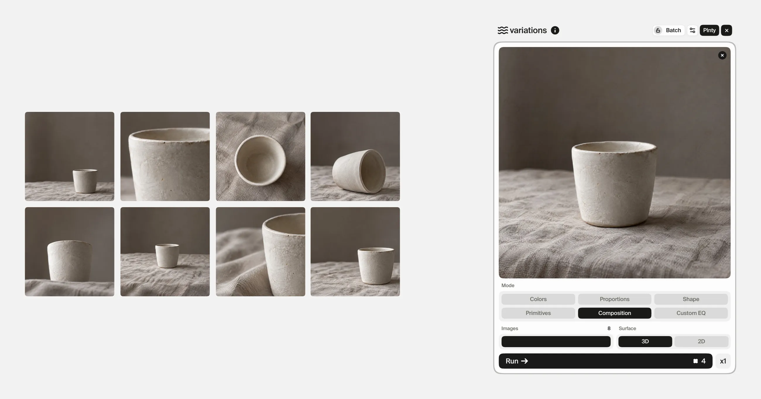
Use variations with the Composition mode to explore framing, placement and staging from an existing image. This tool uses a selected mode rather than a written prompt.
Place the options beside each other and judge them against the intended use. For an editorial layout, you might compare:
- Whether the subject remains clear at a small size.
- Where a headline could sit.
- Whether the crop creates useful tension or simply cuts off important detail.
- How the background directs attention.
Treat the outputs as composition studies. The tool is designed to explore the same subject, but you still need to check for unintended changes.
If you already know the precise revision you want, move to edit-images and describe it instead of generating another open-ended set.
3. Decide whether you need color exploration or a chosen palette
There are two different color questions.
“What other color directions could work?” is an exploration task. The Colors mode in variations gives you alternatives to compare.
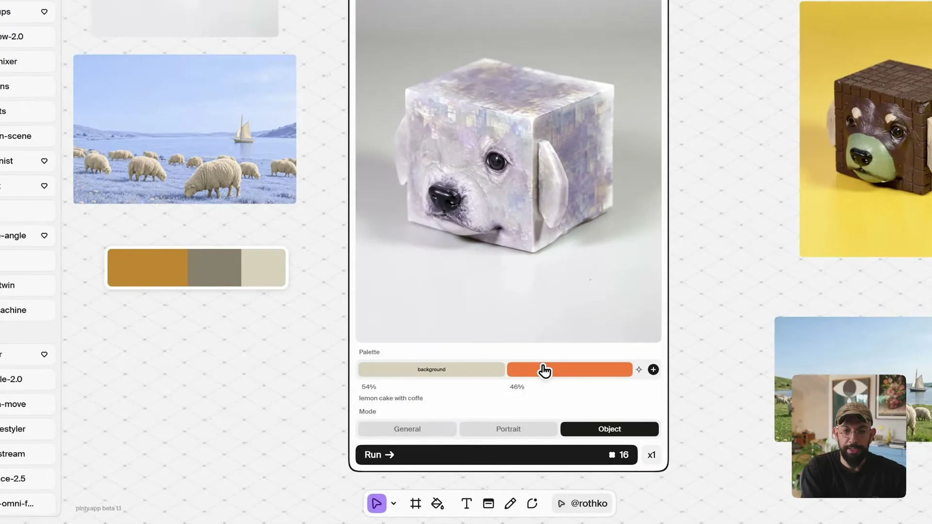
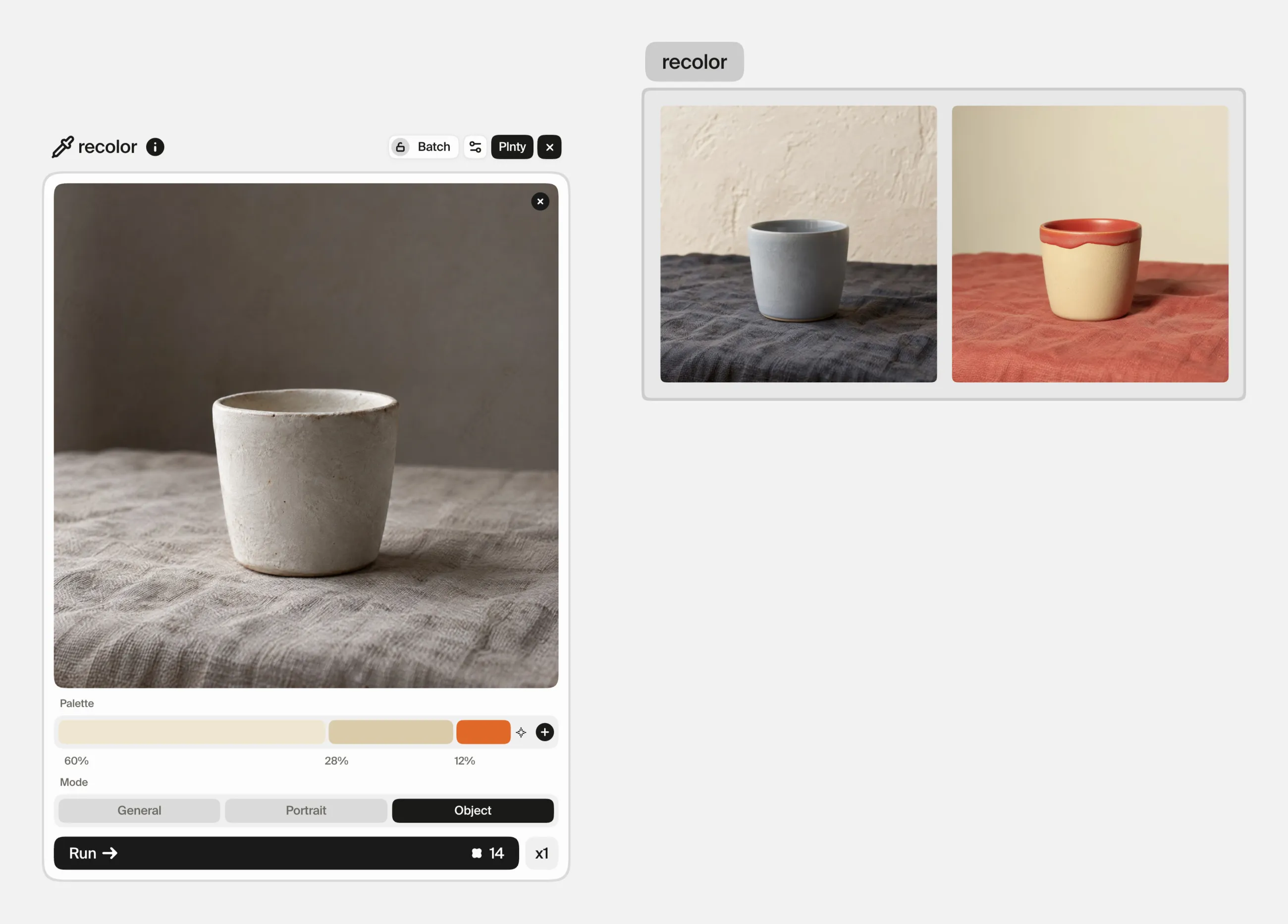
“How would this image work with these colors?” is a palette task. Use recolor to supply a custom palette and adjust the relative weights of its colors.
For the cup image, you could explore a cream-dominant palette with a smaller orange accent. Compare it with a cooler direction before deciding which supports the intended mood.
Look at the whole image. A palette can be attractive in isolation while making the subject harder to distinguish from its background.
For work with strict brand-color requirements, check the finished image against the approved values. A palette guides generation; it does not replace final color verification.
4. Make the next revision specific
When you have a promising result, name the remaining problem.
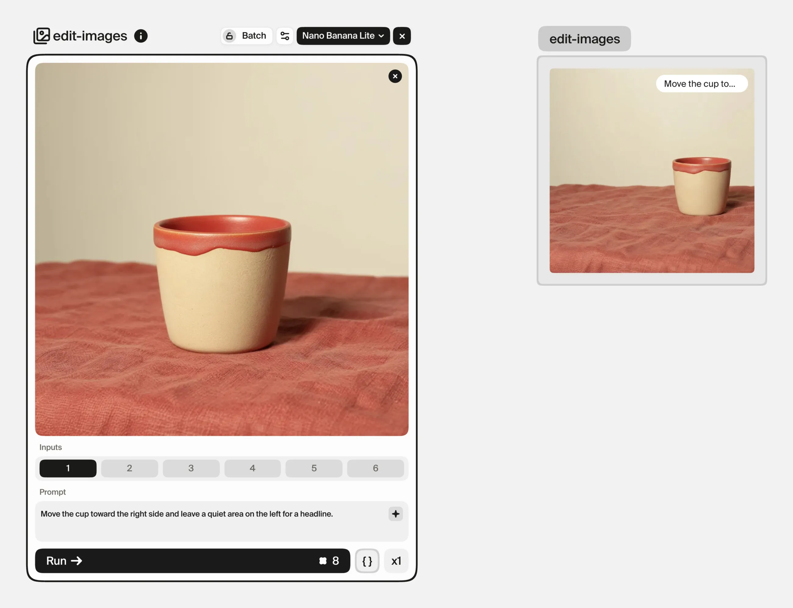
Instead of asking for “a better version,” use edit-images for a focused instruction such as:
Simplify the background and remove the extra object beside the cup. Keep the cup as the focal point.
Or:
Move the cup toward the right side and leave a quiet area on the left for a headline.
These are example directions, not guaranteed outcomes. Inspect the revision against the previous image before accepting it.
For easier comparison, work on one main issue per pass. If you change the background, lighting, material and framing together, it becomes harder to identify which decision improved the image.
Choose the tool that matches the decision
| Your next decision | Plnty tool |
|---|---|
| Apply a visual treatment using separate subject and style references | style-transfer |
| Explore framing, placement or staging | variations → Composition |
| Explore alternative color treatments | variations → Colors |
| Work toward a chosen palette | recolor |
| Describe a particular change | edit-images |
| Explore a more unexpected departure | explorer → Tangents |
You do not need every tool for every image. A reference-led style treatment and one targeted edit may be enough.
Know when the image is ready
Return to the direction you wrote at the beginning. Does the subject still read correctly? Do the material and colors support the idea? Does the composition fit the intended layout?
Choose the image that answers those questions best. Keep a short note beside it explaining why it works and what still needs finishing.
Sources and methodology
The pictures in this guide were made in Plnty on 30 September 2026 with the tools and settings each card shows. The cup is an illustrative example.
About the author

Try it in Plnty
Start with one image and one style reference. Make a deliberate style decision, a composition decision and a color decision. Compare each change with the original before moving on.