How to recolor images with a custom color palette in Plnty
Build a palette, direct the subject and background, and explore new color treatments without starting from a blank image.

In this article
To recolor an image in Plnty, add it to Recolor, create or choose a color palette, and select General, Portrait or Object mode. Label palette colors when you want to direct a particular part of the image, then compare the generated result with your original. Keep the palette on the canvas to reuse it in tools that support palette input.
On this page
Start with a color decision
A different palette can change the feeling of an image before you change its subject. A pale object can become a warm orange study; a portrait can move toward purple and green makeup. The useful question is what you want the color change to accomplish.
Start with an image you can use and one clear goal: separate the subject from its background, explore a different mood, or bring several images toward a shared palette. Keep the original nearby so you can judge more than color alone.
1. Create a palette manually or from a prompt
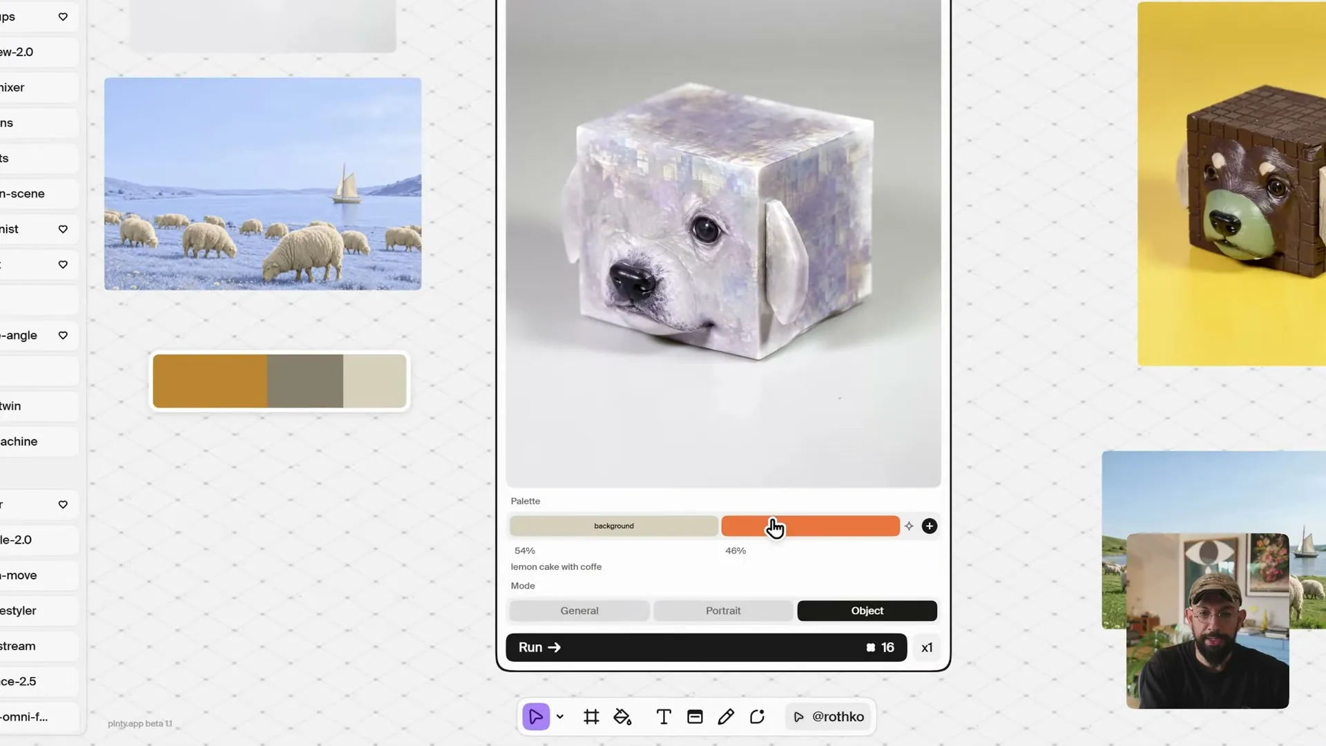
Add a palette element from the canvas toolbar. Choose colors manually when you already have a direction, or describe a color idea to generate a starting palette. A prompt such as “lemon cake with coffee” provides a concrete theme to explore.
Treat the generated palette as editable material. Adjust the swatches before using it, and keep a copy on the canvas beside your source image. That gives you a visible reference for later experiments.
2. Choose a mode and name the color roles
Open Recolor, add your image and supply the palette. The tool offers General, Portrait and Object modes. Choose the mode that matches the image you are working on; the object example uses Object, and the portrait example uses Portrait.
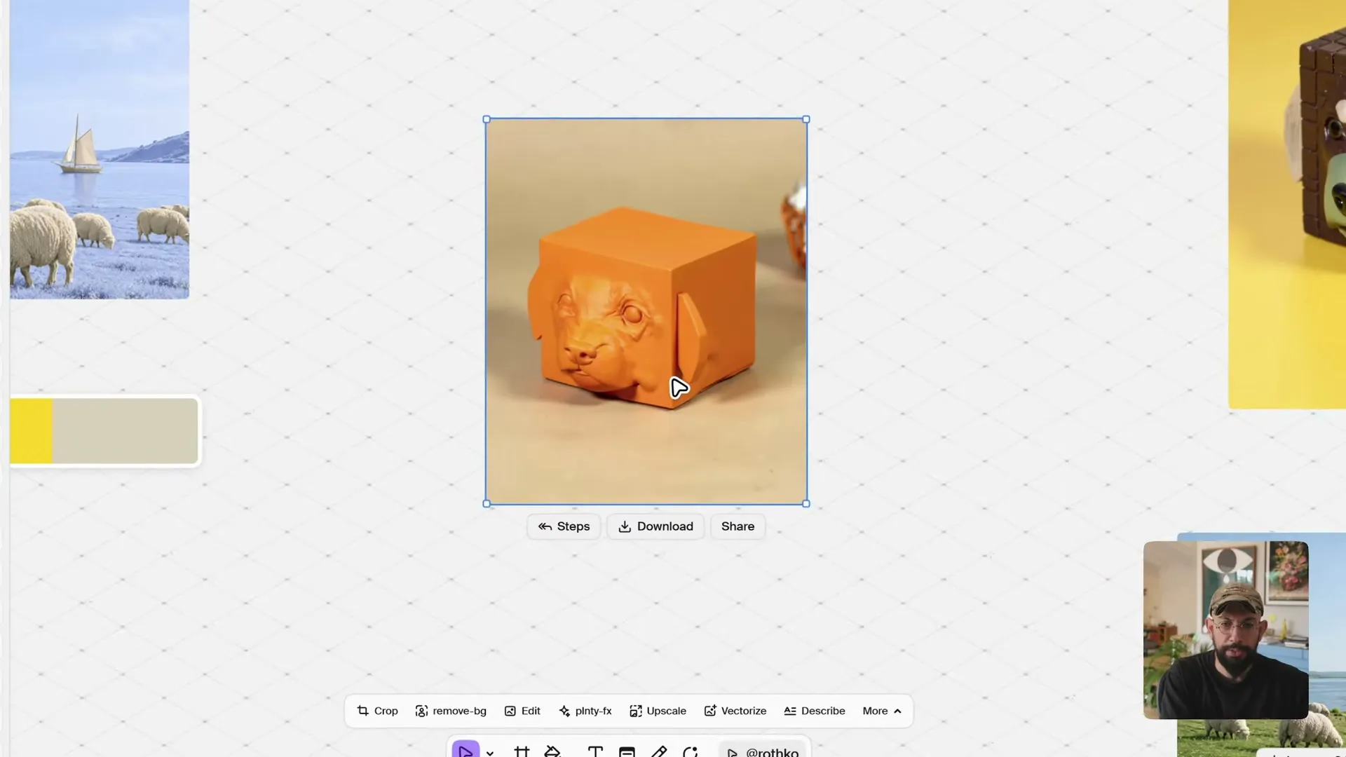
When a color needs to go somewhere specific, give its swatch a descriptive name. In the cube-dog example, a simplified palette assigns a pale color to “background” and orange to “subject.” The resulting image takes on a warm orange treatment against a lighter setting.
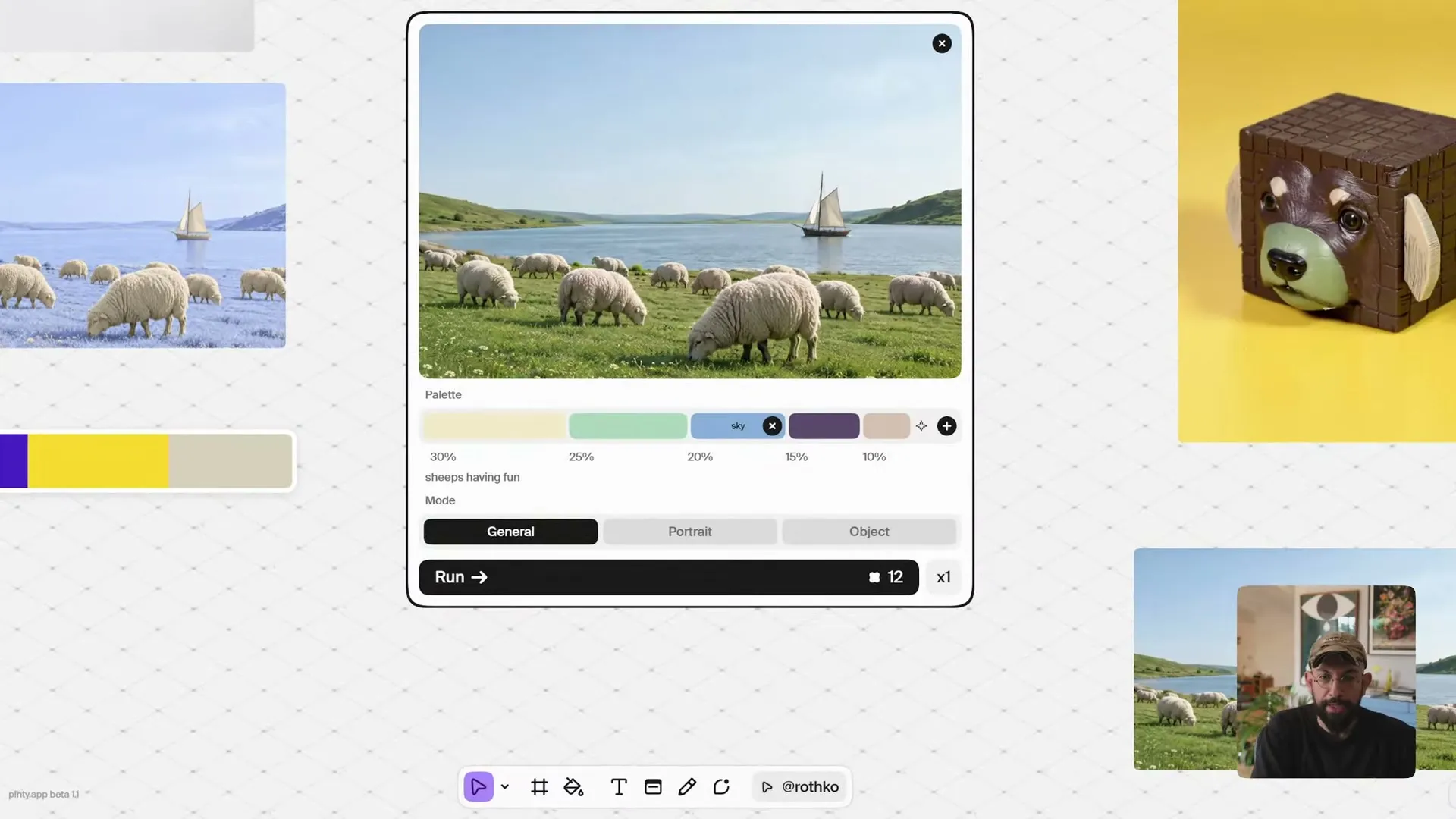
For a landscape, labels such as “sky” and “grass” can express a more specific direction. These labels guide generation; they are not pixel masks. Compare the result with the original to see where the colors went and what else changed.
3. Compare portrait treatments, then refine one choice
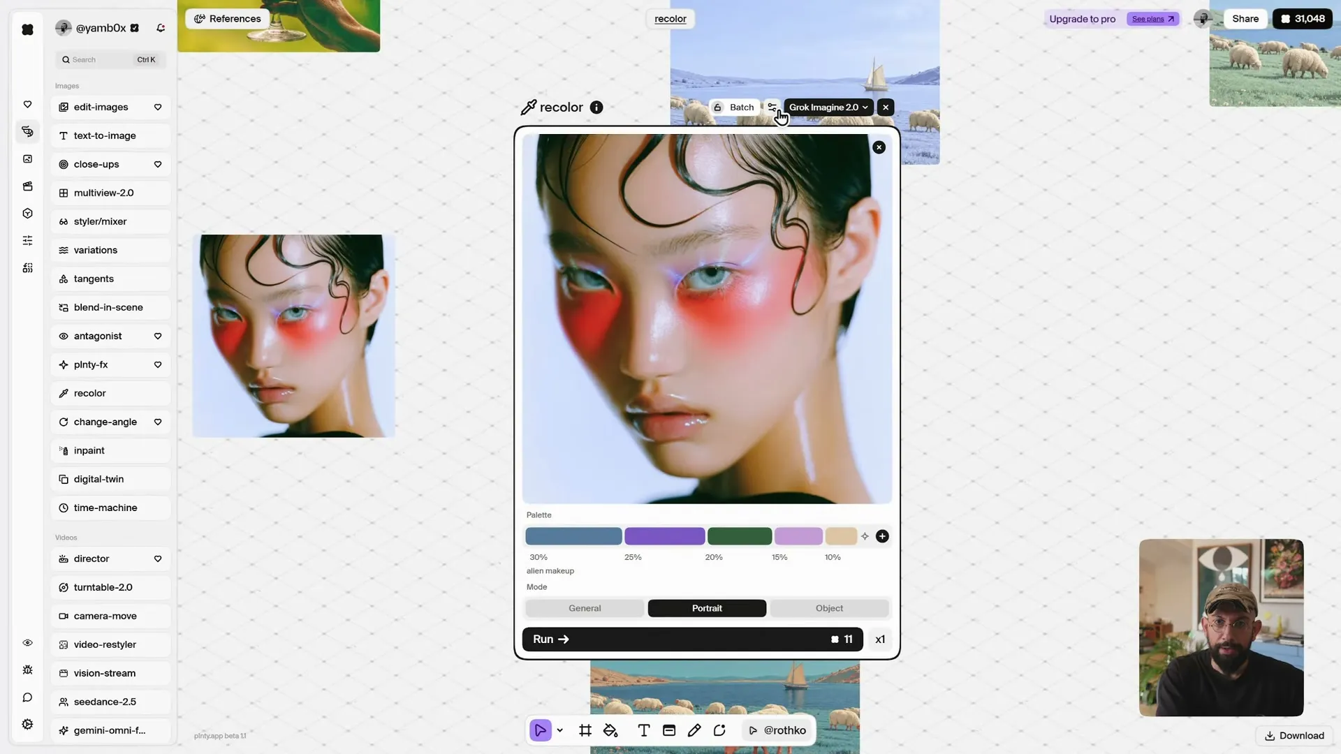
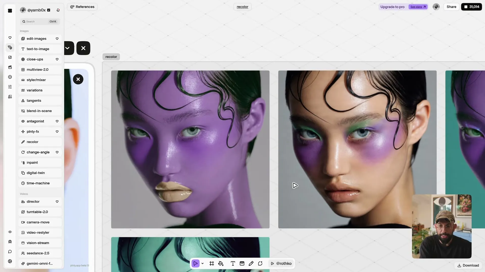
For a portrait, begin with a palette that describes the intended look. The example uses “alien makeup” to explore blue, purple, green and pale neutral tones. Run Recolor in Portrait mode, then compare the options side by side.
The demonstrated Grok and Bria outputs interpret the palette differently. One treatment shifts much of the face toward purple; another concentrates more color around the eyes and cheeks. Use that difference to choose how far you want to push the image, rather than treating one result as automatically better.
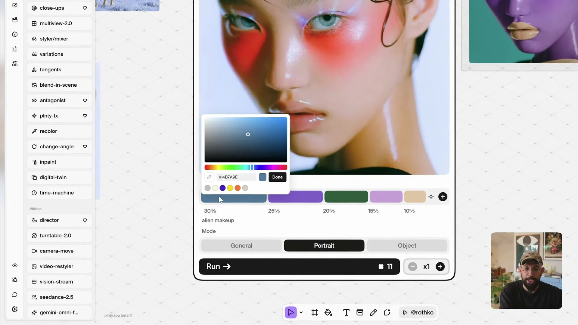
If the background competes with the face, edit a swatch to a more muted color and label it “background,” then run another version. Check the face, hair, lighting and background together before selecting a result.
4. Reuse the palette in a compatible tool
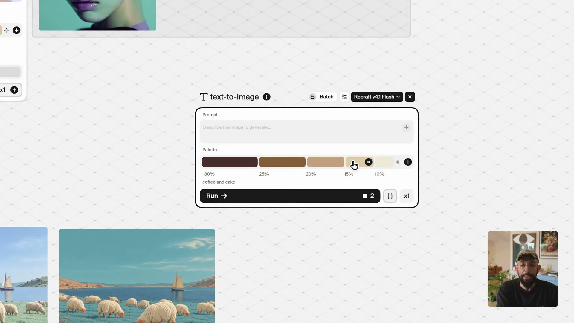
Keep the selected palette on the canvas after recoloring. You can use it as a shared color input when moving into another tool that accepts palettes. The demonstrated text-to-image setup uses Recraft v4.1 Flash with a palette field.
Reusing that input gives the next image a common color direction. It does not guarantee identical rendering across models, or preserve a character, material or composition. Compare the images together and refine the ones that drift from the direction you want.
What should you check before using the result?
- Color placement: Did the intended colors reach the subject, background or named area?
- Image changes: Did the process also alter facial features, material, texture, lighting or details you wanted to keep?
- Consistency: Does the selected result work beside the other images in the project? A shared palette is one part of a visual style, alongside composition, typography and subject treatment.
For brand work, verify the finished colors against your requirements. This workflow is useful for exploration and art direction; the examples do not establish exact color matching or pixel-level preservation.
See Recolor in action
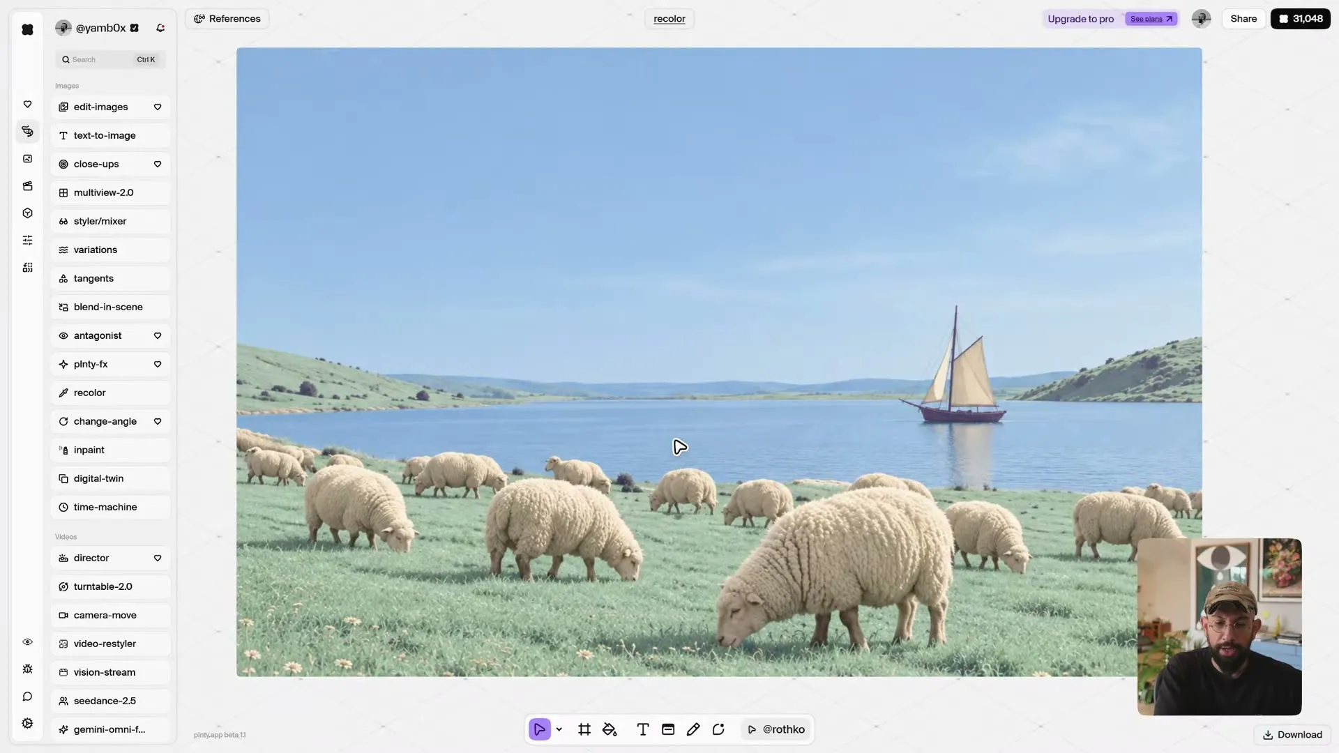
The optional demonstration below shows palette creation, object and portrait recoloring, and palette reuse. You can follow the complete workflow from the steps above without watching the video.
Sources and methodology
Examples are based on Plnty’s Recolor demonstration. Available models and controls may change.
About the author

Try one image in two color directions
Choose one source image and make two palettes: one close to its current mood and one that deliberately changes it. Run both, compare the results with the original, then refine a single swatch or color label in your preferred direction.
The palette is your starting decision. The final image is still your choice.