How to turn a creative brief into three distinct visual directions with AI
A folder full of generated images does not necessarily contain several ideas. If every option uses the same composition, subject treatment and visual metaphor, you may have many versions of one direction.

In this article
To develop distinct visual directions with AI, translate the brief into clear criteria, define a different idea for each route, and build a small set of images that makes each idea understandable. In Plnty, the shared canvas lets you keep the brief, references and experiments together while moving between text-to-image, style-transfer, explorer and variations.
The goal is a set of directions that someone can meaningfully choose between.
On this page
1. Turn the brief into criteria you can see
Begin with the message the work needs to communicate, the audience it needs to reach, and the qualities it must retain.
Consider this illustrative brief:
Create launch visuals for a citrus sparkling drink. The audience is design-conscious adults. The work should feel bright, playful and refreshing. The product must remain recognizable, and the main image needs room for a short headline.
Before generating, translate those words into visual questions.
What would make “refreshing” visible: condensation, open space, a cool surface, or a sense of movement? Could “playful” come from an unexpected scale relationship rather than a smiling character? What makes the packaging recognizable?
Keep the brief short enough to consult while working. Separate fixed requirements from things you are free to explore.
For this example, the product reference and core message stay consistent. Materials, setting, composition and visual metaphor can change.
2. Define three ideas before making three looks
Give each route a one-sentence concept.
For the drink brief, three possible directions are:
| Direction | Central idea | Visual ingredients |
|---|---|---|
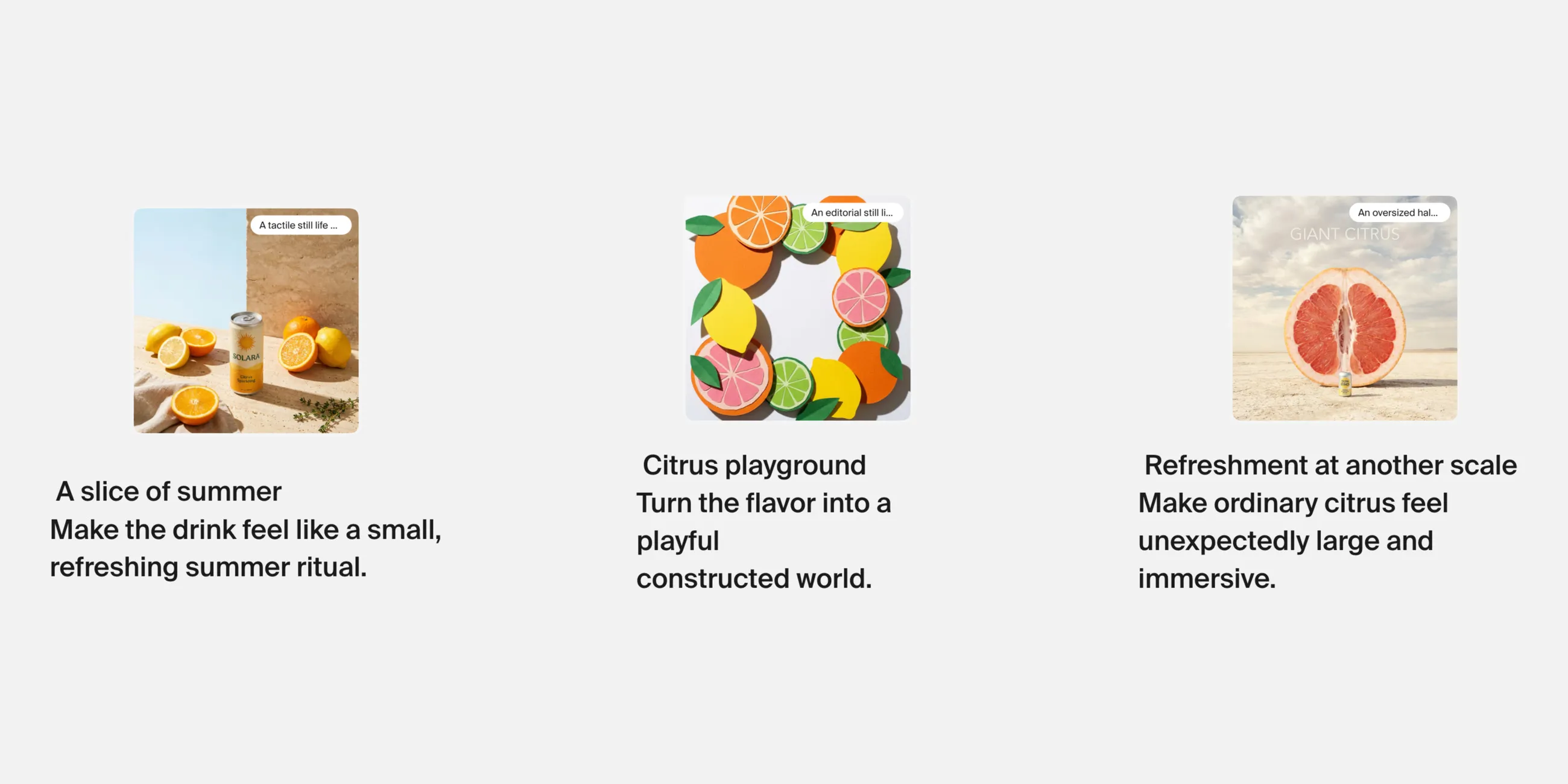
| A slice of summer | Make the drink feel like a small, refreshing summer ritual. | A tactile still life, citrus, sunlight and generous space. |
| Citrus playground | Turn the flavor into a playful constructed world. | Cut-paper forms, bold shapes and graphic arrangements. |
| Refreshment at another scale | Make ordinary citrus feel unexpectedly large and immersive. | Oversized fruit, surreal proportions and a small product within the scene. |
These routes differ in how they communicate the message. Changing the background color alone would not create that distinction.
A direction name is useful when it helps you decide what belongs. If an image looks good but does not support the route’s central idea, move it aside.
3. Build a starting image for each route
Use text-to-image when you need to invent a scene from a written description. Describe the subject, arrangement, materials and mood that matter to that direction.
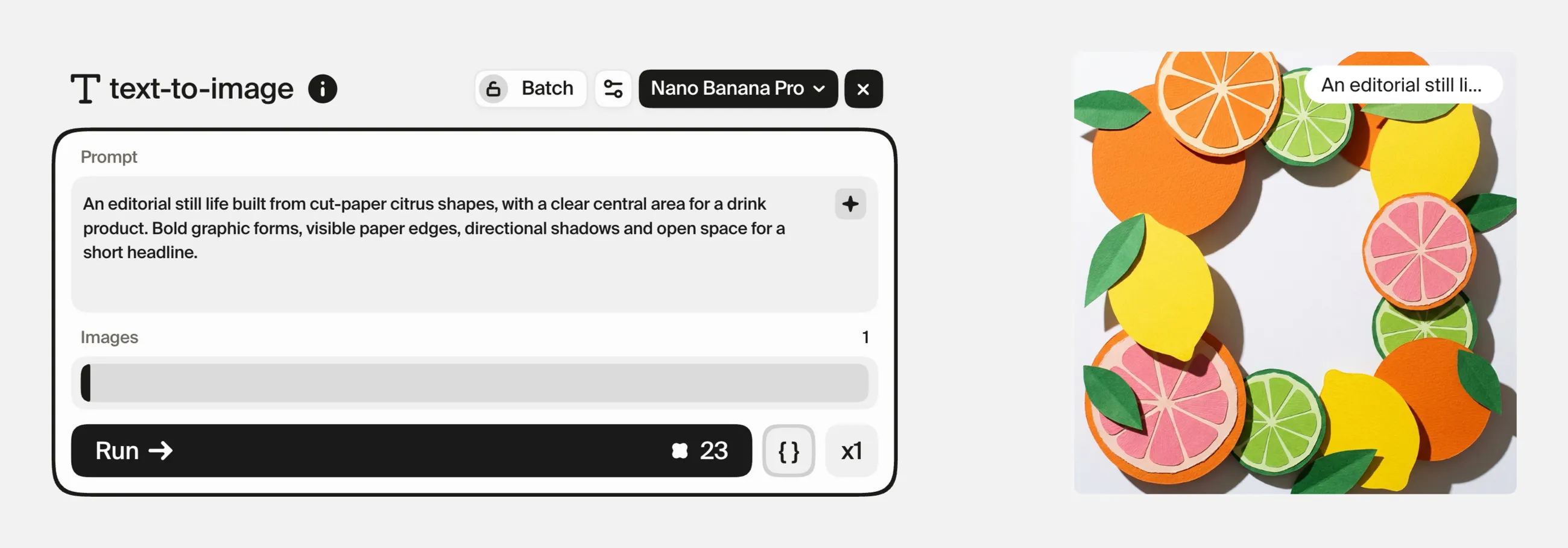
For the cut-paper route, a starting instruction could be:
An editorial still life built from cut-paper citrus shapes, with a clear central area for a drink product. Bold graphic forms, visible paper edges, directional shadows and open space for a short headline.
Treat this as a starting scene, not proof that the exact product or packaging will appear correctly.
When the real product needs to guide the image, bring its photograph into a reference-based workflow. style-transfer lets you distinguish the product as Subject from an image that supplies Style.
Start with one clear style reference per direction. Add more only when each contributes something specific. An overcrowded reference set can make it difficult to tell which qualities are driving the result.
Arrange the three routes in separate areas of the canvas, with their brief sentences and references nearby.
4. Use explorer when a route feels too predictable
Sometimes the first image communicates the brief but offers little surprise.
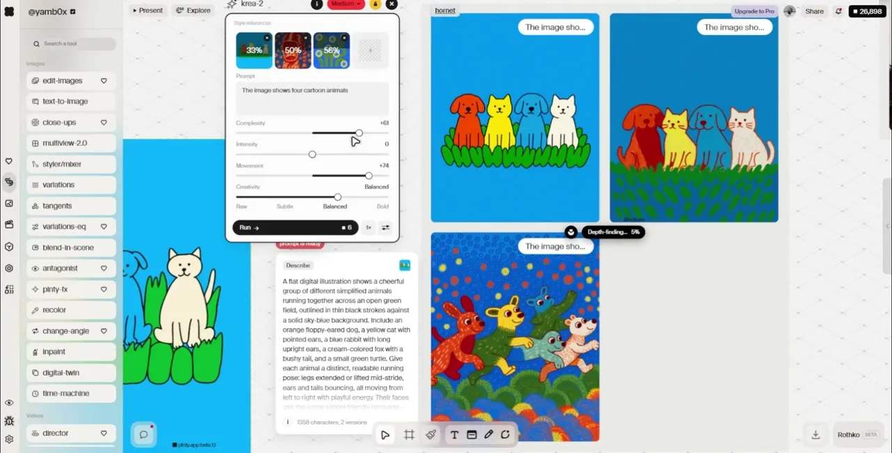
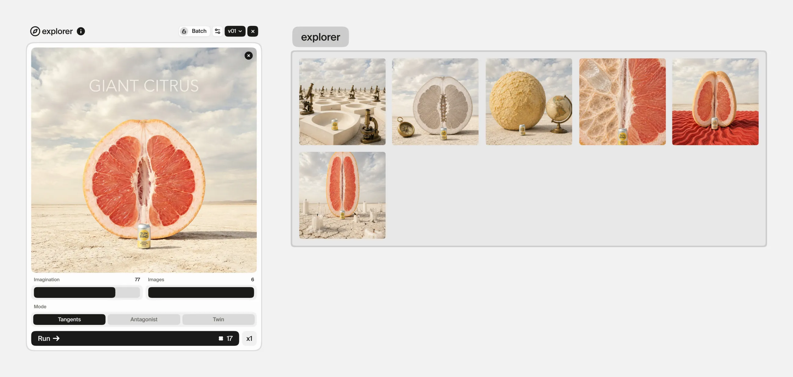
explorer, in its Tangents mode, explores departures from an existing image through an Imagination control. It does not take a written prompt. Lower settings are intended for smaller departures; higher settings allow the visual treatment to move further.
Use it when you want to discover something you would not have specified in advance.
For the surreal citrus route, that might mean exploring an image already built around an unusual scale relationship, then looking for an unexpected arrangement worth developing.
Judge the results against the route’s idea. An unusual result is useful when it strengthens the concept. If it changes the subject’s meaning or makes the product unrecognizable, it may belong in a different experiment.
Keep interesting discoveries visible, including ones you decide not to pursue. They can clarify the boundary of the direction.
5. Use variations to develop a promising idea
Once a route has a clear identity, use variations to explore a particular dimension within it.
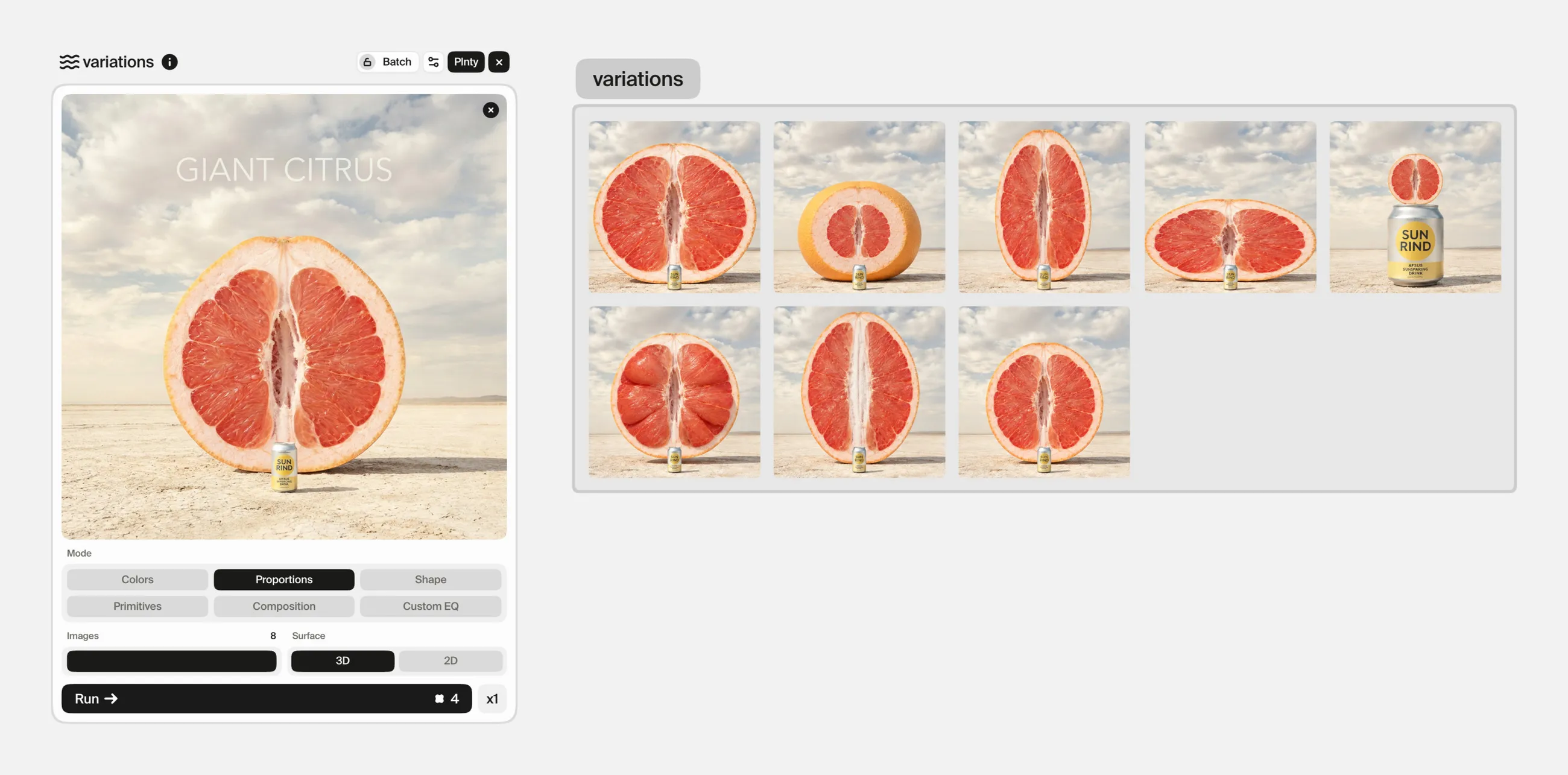
For the summer still life, investigate Composition to find stronger framing. For the paper direction, investigate Colors. For the surreal route, Proportions may help you explore the scale relationship.
This is a different task from inventing a new route. You are looking for a stronger expression of an idea you have already chosen.
Avoid changing every dimension at once. Keeping the central idea stable makes it easier to judge whether a new color treatment, crop or proportion improves the work.
Build a small selection for each route: a lead image and a few supporting studies. You need enough to explain the direction, not every generation made along the way.
6. Compare the directions against the same brief
Review all three routes together.
Ask the same questions of each:
- Does the main message come through?
- Is the product recognizable?
- Does the direction feel appropriate for the audience?
- Is there room for the intended copy?
- Could the idea support more than one image?
- What still requires correction or production work?
Name the trade-offs. The still-life route might be easier to read immediately. The paper route might offer a stronger graphic language. The surreal route might be more distinctive but require closer attention to product detail.
Those are hypotheses to assess in the actual work, not conclusions to assume before making it.
7. Refine the chosen route into a usable next step
Once a direction is selected, write a short explanation of what makes it work: its composition, material treatment, palette and central idea.
Then use edit-images for specific revisions, such as simplifying a background or removing a distracting element. Keep checking details that generation may change, particularly packaging, lettering and product shape.
The useful deliverable is an image accompanied by a clear creative decision. A teammate should be able to understand what to preserve when developing the next asset.
Sources and methodology
The pictures in this guide were made in Plnty on 30 September 2026 with the tools and settings each card shows. The drink brief is an illustrative example; the headline on the grapefruit picture was drawn by the model.
About the author

Try it in Plnty
Take one brief, define three genuinely different ideas, and build one lead image for each. Choose a direction by explaining how it answers the brief, not simply which image looks most impressive.