How to keep AI campaign images visually consistent
Build a coherent AI campaign image set by defining an anchor image, references, palette and review rules, then adapting the imagery to each layout.
In this article
To keep AI campaign images visually consistent, choose an approved anchor image and define the rules that make it recognizable. Reuse the relevant references, palette and visual treatment, then review each new image against the anchor. Keep some elements fixed while allowing composition and subject details to change for the job.
Consistency does not require every image to look identical. It requires the set to feel like the same campaign.
On this page
Start with an approved anchor image
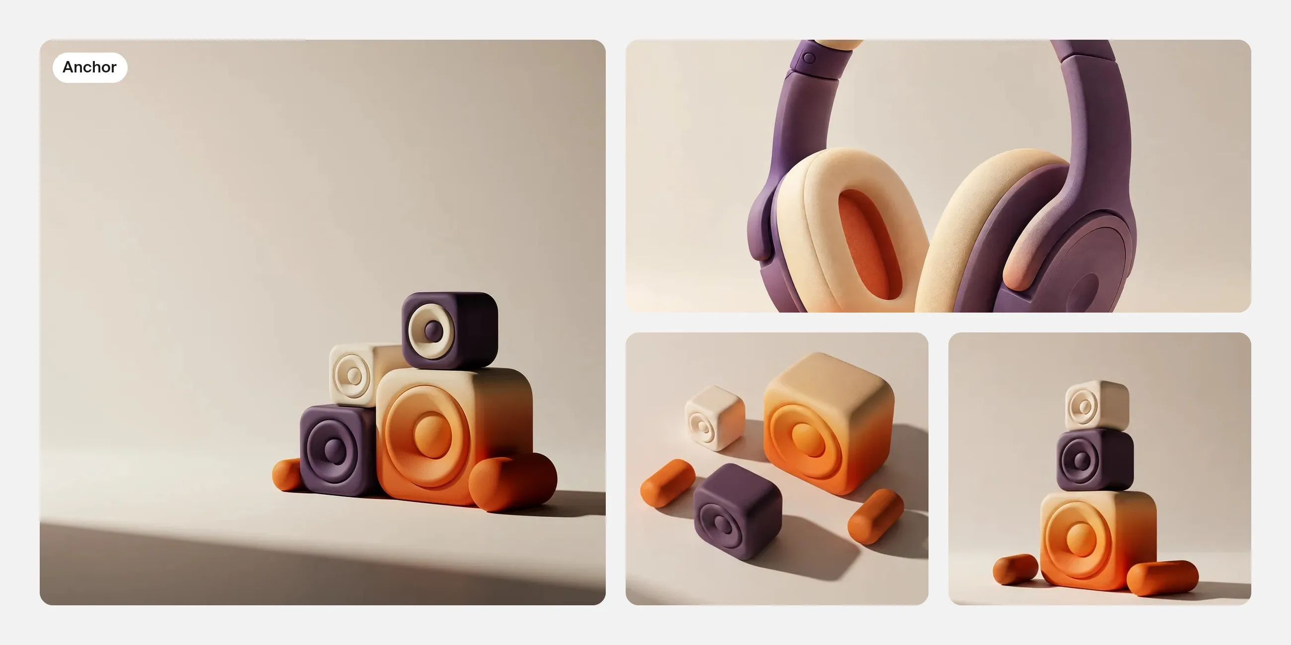
Choose an image that already expresses the intended direction. It should be strong enough to guide the campaign and clear enough to explain.
For a fictional music campaign built around sculptural sound forms, the anchor might establish rounded shapes, a limited palette, soft side lighting and a clean background.
Do not use an unresolved image as the reference for the whole set. If you dislike its surface finish or lighting, refine those decisions first. Otherwise, later images may repeat the very qualities you intended to change.

Write the rules you will keep
Keep the visual rules short and observable.
| Element | Example rule | What can vary |
|---|---|---|
| Palette | Use the approved violet, cream and orange relationship | Which color dominates a particular image |
| Form | Rounded sculptural shapes | Their arrangement and scale |
| Material | Soft, tactile surfaces | Small surface details |
| Lighting | Broad side light with restrained contrast | Framing around the subject |
| Composition | One clear focal area and space for type | Vertical, square or wide arrangement |
“Make it on brand” is difficult to evaluate unless you can say what the brand treatment contains. A few clear rules are more useful than a long list of unrelated adjectives.
Give references specific roles
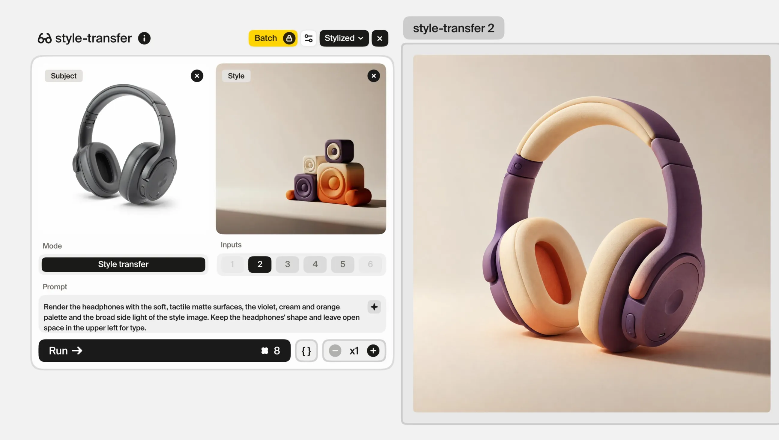
In Plnty, Style transfer mode lets you separate subject and style references. Use the approved campaign image or an appropriate visual reference to guide the treatment, and use a subject reference when a specific object needs to appear.
Start with a simple combination. If the result copies unwanted objects from a reference or changes the subject too much, reconsider the images and their roles.
The reference gives direction. It does not guarantee matching identity, lighting or composition in every result. Review the actual image rather than assuming the input makes it consistent.
Correct the dimension that has drifted
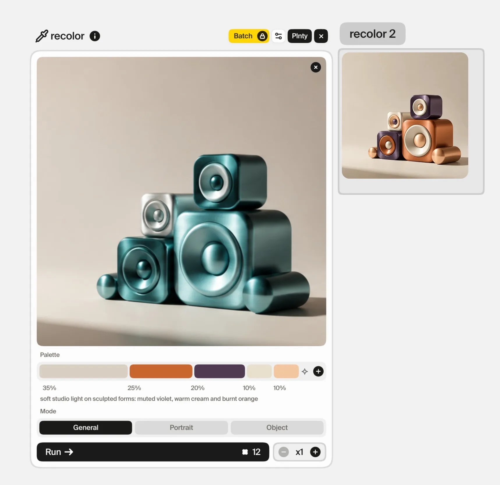
Compare each new candidate with the anchor and identify the mismatch.
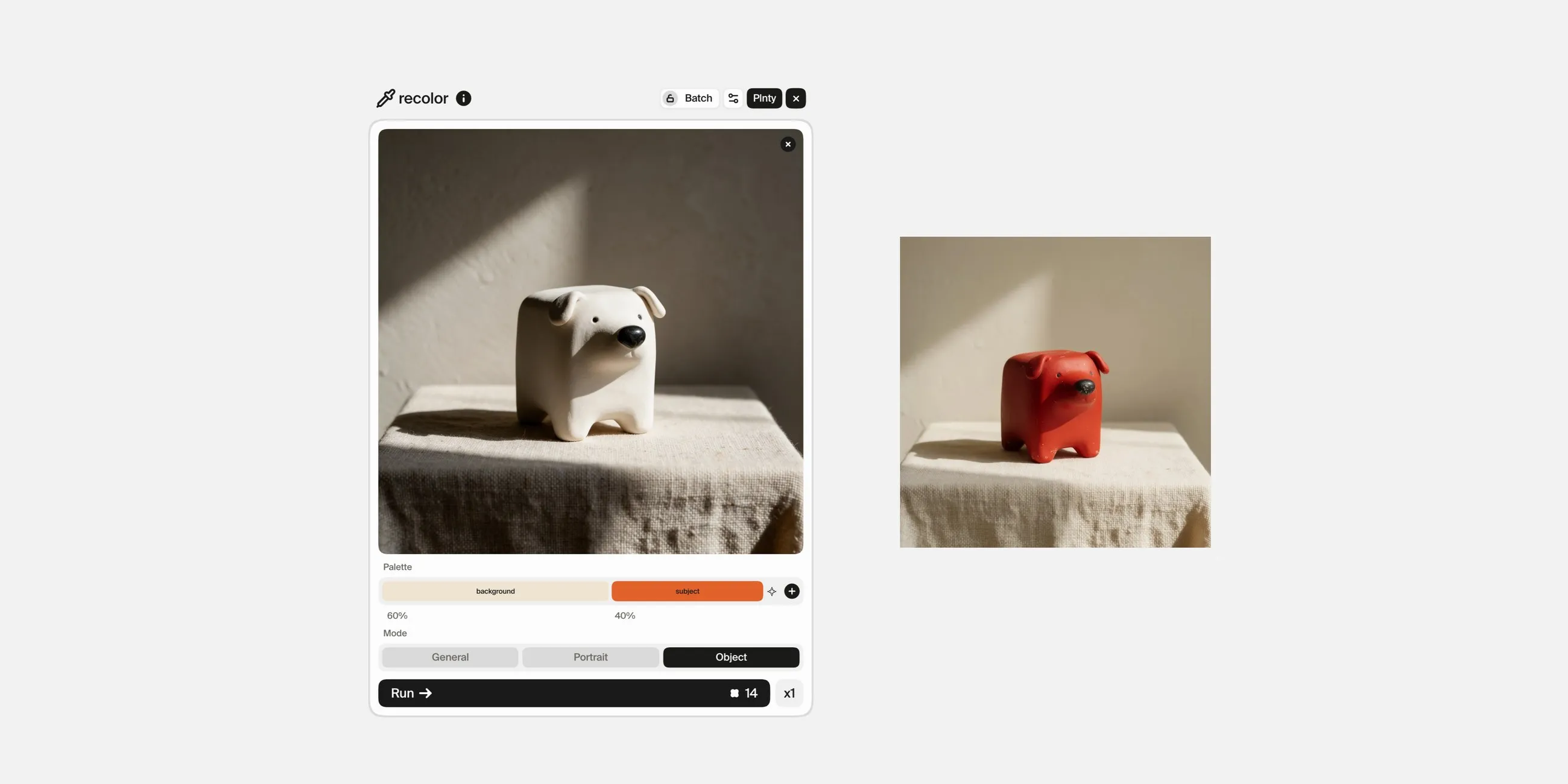
If the structure and material are right but the palette has wandered, recolor lets you work with a chosen set of colors and relative weights. Inspect the result for readability and hierarchy as well as palette similarity.
If the issue is an object, background or lighting choice, use image-gen in edit-image mode for a focused correction. For example:
Simplify the background and soften the contrast to match the approved campaign direction. Keep the main sculptural form and leave the upper left area open.
A color correction cannot solve an incompatible material or a composition with no usable space. Match the tool to the actual difference.
Adapt the composition to the format
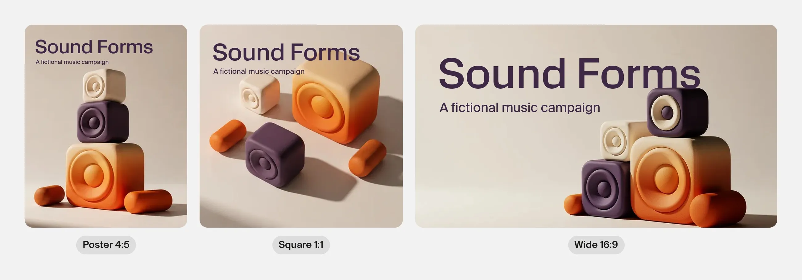
A poster, a square social image and a wide banner have different framing needs. Keep the visual rules consistent while designing each composition for its output.
Check where the headline, logo and supporting information will go. If a crop cuts through the focal object, create a related arrangement rather than accepting a weak layout.
Use your layout workflow to add final text and graphic elements. Review the campaign imagery again once those elements are present. A picture that feels balanced on its own may compete with the message when placed in the design.
Review the set together
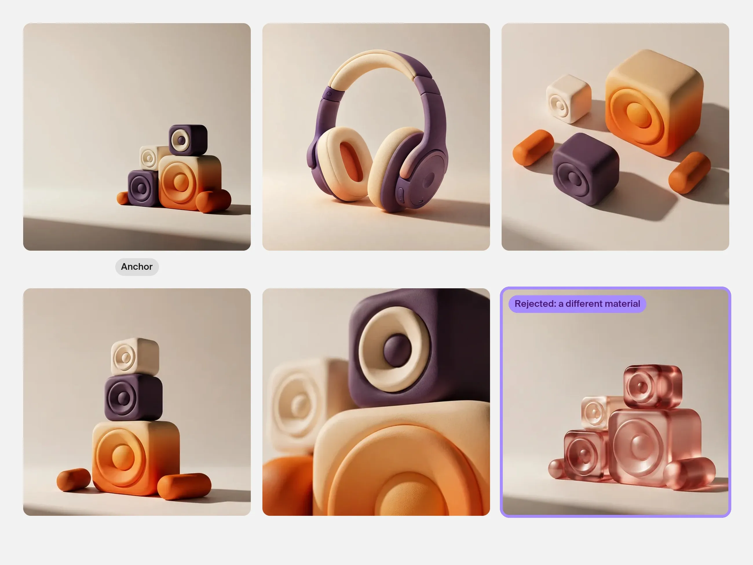
Arrange the candidates beside the anchor. Temporarily ignore which one you like most and look for outliers.
Ask:
- Does one image introduce a different material or rendering style?
- Is one composition much more detailed than the others?
- Does the palette have a similar visual balance?
- Are lighting and contrast compatible?
- Is each image useful for its assigned layout?
- Are recurring objects or characters still recognizable?
Rejecting an attractive outlier can strengthen the campaign. Keep exploratory images available for future work without forcing them into the current set.
Common questions
Will using the same prompt keep every image consistent?
No. Repeated wording can guide the work, but the outputs still need comparison. Approved references, explicit rules and focused corrections give you a more useful review process.
Is the same color palette enough?
A palette is one part of consistency. Shape language, material, lighting, composition and detail density also affect whether images belong together.
Should I generate one image and crop it for everything?
Use crops when the composition survives them. Create related images when the layout needs a different arrangement. The campaign idea should remain recognizable across both.
Sources and methodology
The images in this guide were made in Plnty on 1 October 2026 with the tools and settings each card shows. The campaign is fictional; its layouts were made outside Plnty.
Try it in Plnty
Choose an anchor image in Plnty, define the rules that make it yours, and build a small campaign set around those decisions.